
veggie flavor

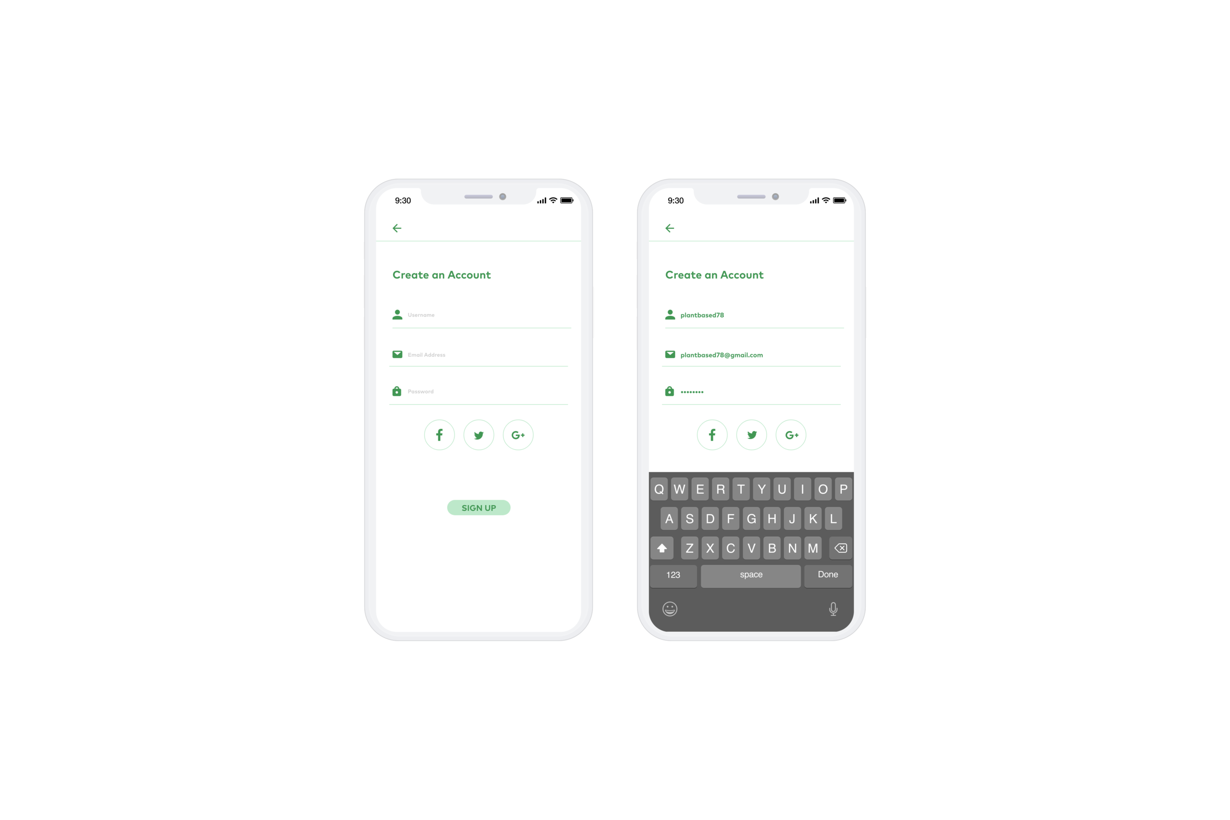
Veggie Flavor is a mobile application that helps vegetarians cook, eat and stay healthy all while having a busy day. It allows users to search and follow along recipes, text and video format, add ingredients to grocery list and check them off as they shop. The application also has a calorie tracker where users can log in their daily foods. As a UX product designer I focused on research, interviews, ideating, storyboarding, creating a solution, wire flow, user flow, prototyping and testing.
the role
As a solo UX product designer I focused on research, interviews, ideating, storyboarding, creating a solution, wire flow, user flow, prototyping and testing.
the problem
Many people struggle with cooking, eating and staying healthy all while working or attending a full day of class.
the solution
Veggie Flavor combines the functionality for cooking and buying what’s necessary for users’ meals and letting the user cook meals without adding time or stress to their lives. Veggie Flavor lets you create a grocery list and track your calories to encourage users to grocery shop regularly and stay healthy. The user can search for recipes based on their diet restriction(s) and still be able to enjoy the process of shopping, cooking and their delicious meal.
research
To better understand and gain empathy for the target group, I proceeded in conducting research through structured facetime interviews, empathy mapping, personas and user testing. I asked questions to allow the user to have conversations and speak their mind that provided me insight into their feelings and experiences.
Affinity Map
The map is broken up by personal information, meals, exercises, grocery shopping and other.
All 5 interviewees are around the same age ranging from 22-26, either they work or are in college and this is the prime age where 20 year olds make their career so they are working busy hours not worrying about other things and I've noticed that in the interview, many of them have stopped going to the gym everyday because they are tired or get home late from work which also has an affect on their health and diet, they won’t cook proper meals and eat whatever they can make easily.

empathy mapping
I thought this was a perfect time to ask the interviewees how they feel about COVID and if it’s restricting them from doing anything and they all said “not being able to go to the gym so I try to work out at home, but it’s not the same because I feel unhealthy even if I try to eat healthy.”
Left - She enjoys cooking and is somewhat satisfied with her resources in finding new recipes but also has diet restrictions on certain foods but that helps her save money when grocery shopping.
Right - He doesn't like cooking because of the prep and clean up time and is not satisfied with his resource which is youtube because it takes too long to find a good enough recipe video.


Personas
Pam is a med student who prioritizes school over other things but health is still important to her and when she has time she will exercise or make a healthy meals
Michael is an engineer and very big on staying healthy and eating the right food so he looks for easy prep meals


Design Phase
site map

user flow

red routes


Usability Testing
For this guerilla usability test, I was testing how the users would interact with the mobile application, how the users understood it and what their thoughts were by adding ingredients to the grocery list and checking off a recipe so it could get added to the calorie tracker and adding foods to their calorie log. I was hoping to discover if the users were able to easily understand the app and get through the tasks without too much trouble. I used Marvel to conduct this test. I conducted this test at home and had asked my 5 users to video call me and share screens so I could note down their thoughts and actions as they were testing the app. I asked a few friends and family members who had some background knowledge on recipe and health apps.
Findings
Three of the users said they would like to see more of it and would definitely test the app again. The test made it clear as to what changes need to be made.
The bottom bar was not visible to the user, had to scroll down to view
All pages were easily understood
Given task was confusing because they did not know which button to click on first
“There are multiple apps I would have to download to do these tasks such as keeping a track of my calories/diet and another app just for recipes but this is 2 in 1 and it’s just one less app I would have to download which makes a big difference because of storage issues.” -Brian
“I lack confidence when i try cooking or baking at home because i don’t think i can do as well as others.” -Samantha
“I never know what ingredients i’ll need until i have to do research on my own or ask my mom.” -Cameron
“My mom cooks ethnic food at home 98% of the time and i only know how to make easy American food like pasta, mac-n-cheese, burritos and grilled cheese, how can i learn to make ethnic food without my mom’s help?” -Alisha
“I want to keep a track of the foods i eat so i can stay healthy.” -Harry

wire frame


Some questions that were asked:
How do you find recipes you want to cook?
Do you keep a track of your calories?
How do you feel about the UI on x page?
Do you understand what the icons mean?
How do you feel about x task?
By asking these questions I found out the users find their recipes either online or asking their family and friends and some feel their resource is not meeting their needs. The users want to keep a track of what they eat and how much but they don’t know where to start and think they might not continue tracking their calories. The UI got positive feedback, the icons tasks given were somewhat easy to understand and follow.
After I refined the design direction, I continued the design process by prototyping. I realized that some of the features and icons were inconvenient or unclear. For example, one of the tasks was to add the ingredients to the shopping list. The icon that was designed for that task was a white plus sign. All of the users had a hard time figuring out how to add the ingredients because the icon itself was not self explanatory. After the user testing, i decided to get rid of that specific icon and replace it with a button “Add to grocery list” which was much easier to understand.
mood board
For my mood board I gathered images of everyday foods but a vegetarian recipe, so the users can still enjoy wraps or burgers without meat. I wanted to include a lot of vegetables to show that you can still eat good food but take the healthier route. Green is the first color people think of when you say vegetables or eating healthy so I wanted to include enough green so the user feels engaged.

style guide
I wanted to show green because that color is associated with vegetables and eating healthy, you can see that in my style guide, the colors are very subtle, the buttons and icons are green. The typography fonts i chose for the header is bold and easy to read, same with the body copy.

high fidelity mockup


process & understanding
During the process of creating Veggie Flavor I went from many iterations by having a conversation with a few people but understanding their thoughts about the app. In the beginning it was always about how I can possibly do everything perfect for the users without anyone giving any criticism but i soon realized that was not possible without getting their honest feedback. At the end of the day, creating this app to help young adults save money, enjoy cooking and staying healthy is the highest reward.