
berry.care
Berry.Care is an Android mobile application that helps users take care of their oral health by instant screening of the mouth using Augmented Intelligence. The application allows users to submit oral symptoms, take pictures of their mouth and allow doctors to review the reports. Background information such has design assets were provided by the client. As a UI/UX designer I focused on interviews, ideating, creating a solution, wire flow, prototyping and testing.
the role
My role was to undertake user research, evaluation and designing the prototype during the iterations of the product’s development.
the problem
“I don’t want to look at images of a mouth... that’s gross.”
“I don’t have access to see a doctor where i live”
“I can’t afford to see a doctor”
the solution
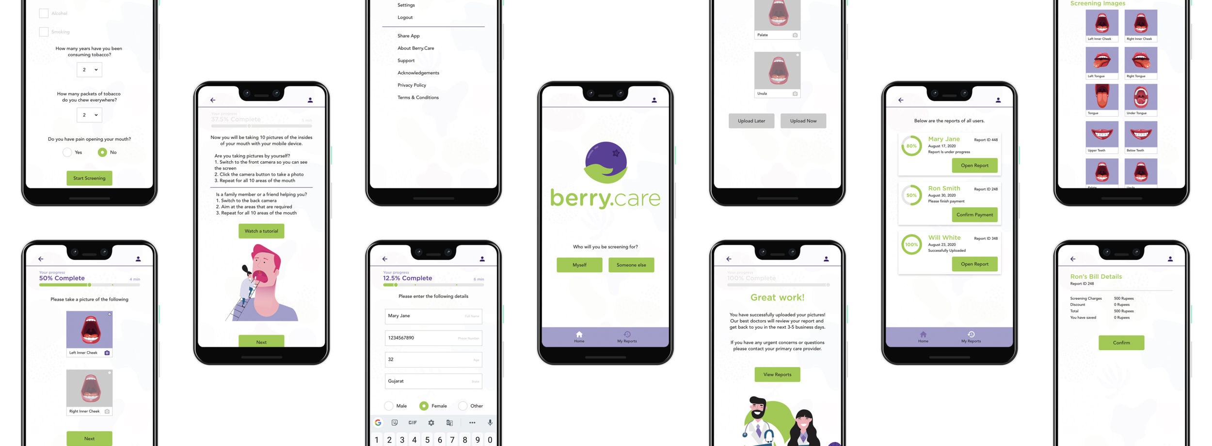
Berry.Care evaluates the feasibility of using the mobile phone as a documentation and communication tool for early detection of high-risk oral lesions particularly in rural and remote communities where the required information infrastructure is lacking. Berry.Care allows the user to go through the screening process without any stress. The application also has the ability to screen others, family or friends who do not have access to a smartphone.
the original app design


research
To better understand and gain empathy for the target group, I proceeded in conducting research through user interviews and testing.
Some questions that were asked:
How do you seek medical help?
How comfortable are you with x process?
How do you feel about the UI on x page?
How do you feel about seeing your oral screening images?
user interviews
In my user interviews I tested this application on 5 people who were between the ages of 27 to 32. Through the interview I was able to get insight and feedback on what the users felt about the application.
“How am i supposed to keep a track of how much i finished or have left to do?”
“Why do i have to take pictures of all 10 areas of the mouth to go to the next step?”
“I don’t understand each part of the mouth im taking pictures of”
“How many times am i going to do my own screening and fill out my information?”
“I can see what each part of the mouth is but I don’t understand how they function and what their importance is.”
“Why cant I upload a profile picture to my profile?”
Users have a hard time seeking help from a doctor in person due to living in rural areas
User lets the pain pass which results in a bigger consequence
Users were dissatisfied viewing the images of a mouth
Users were getting frustrated with the number of screening images
Design Phase
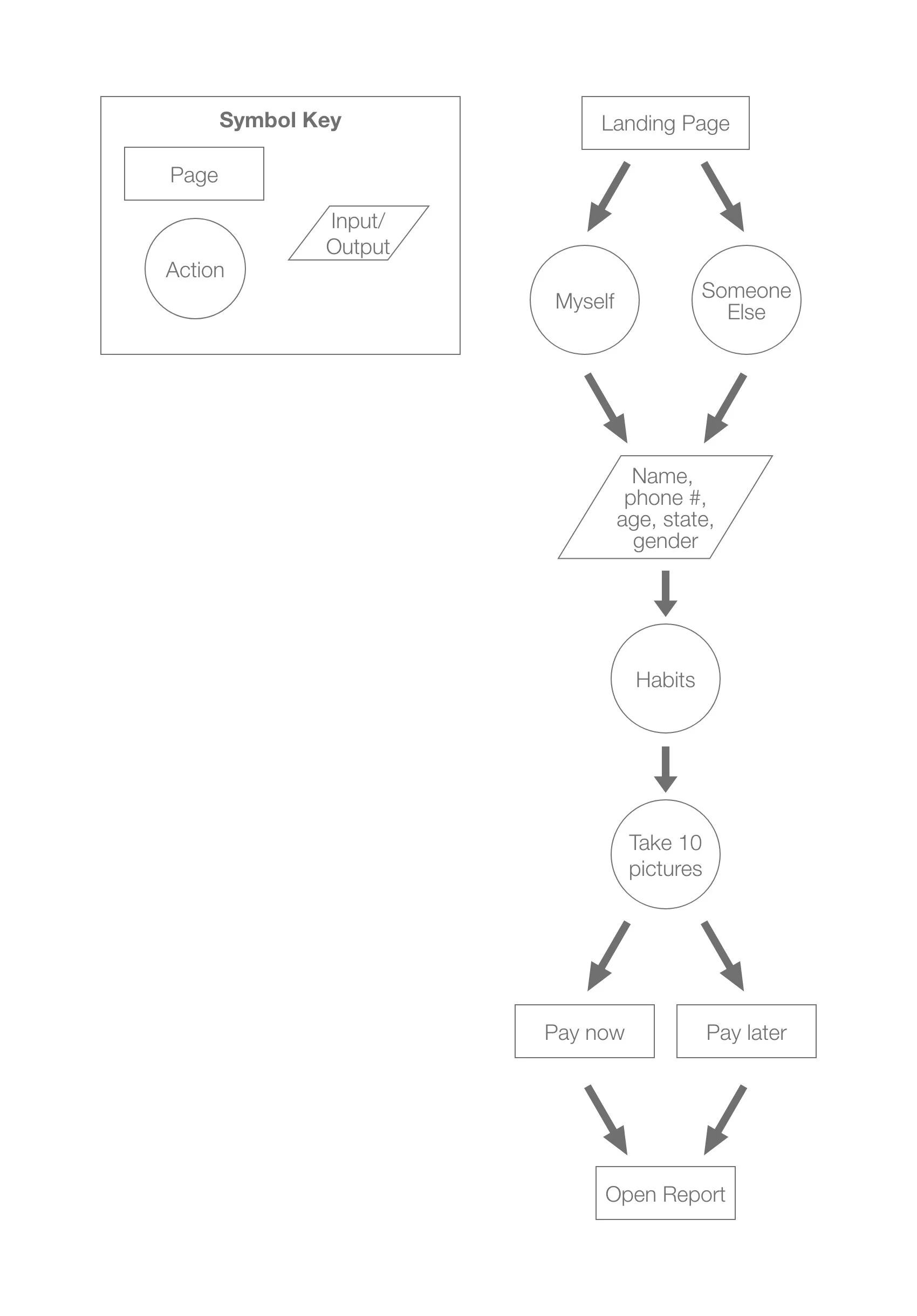
user flow
The task I had the users complete was to create a report for the doctors to review and that was done by filling out the required information such as personal and symptoms and uploading screening images which users have a hard time with.
sketching solutions
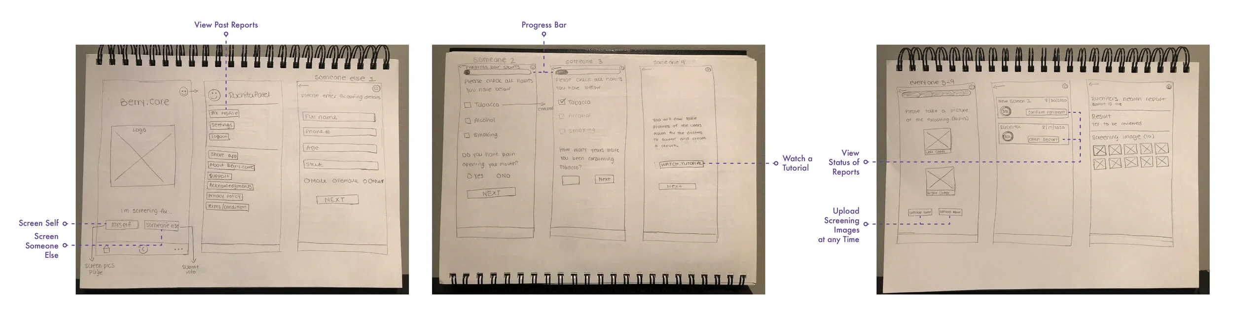
wire frames
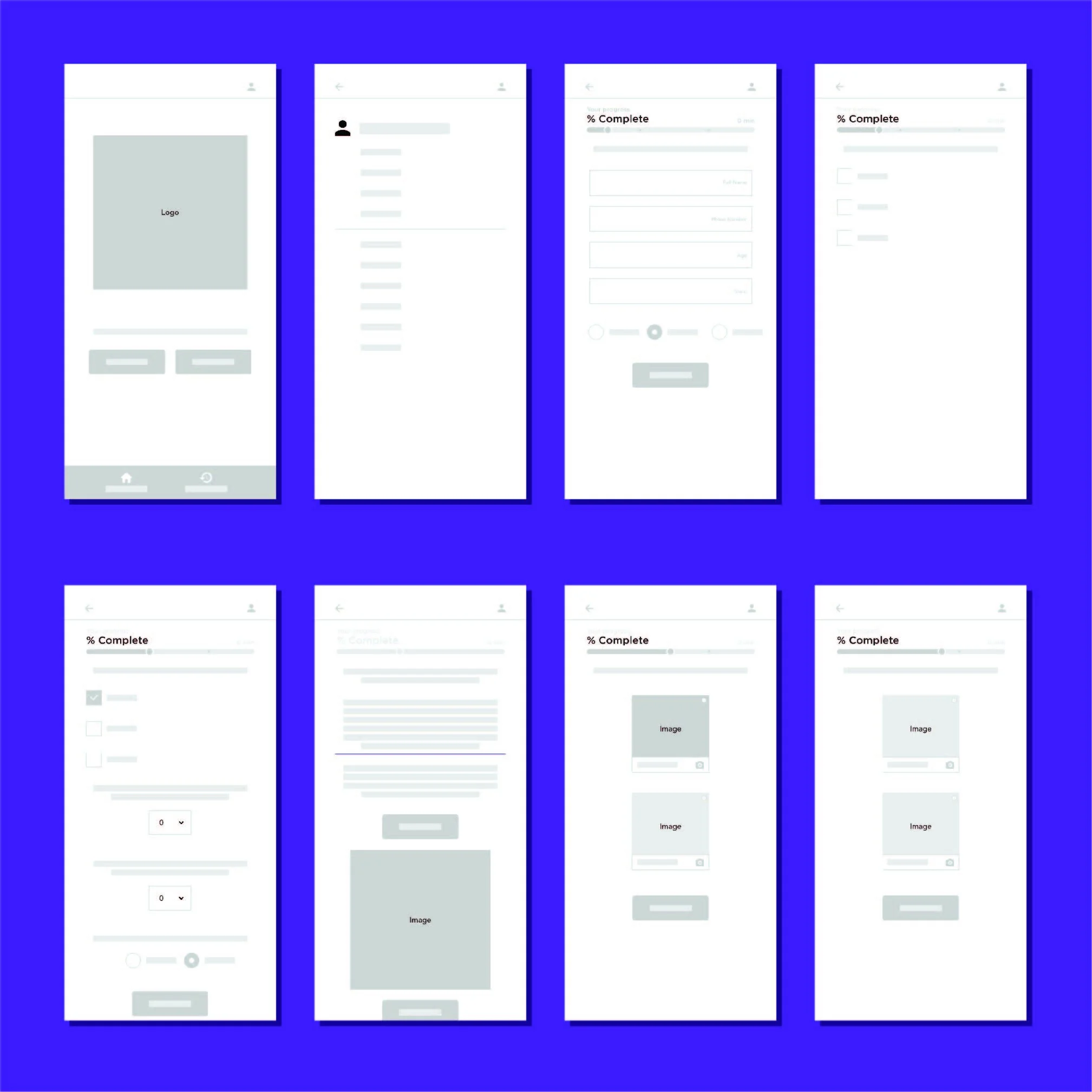
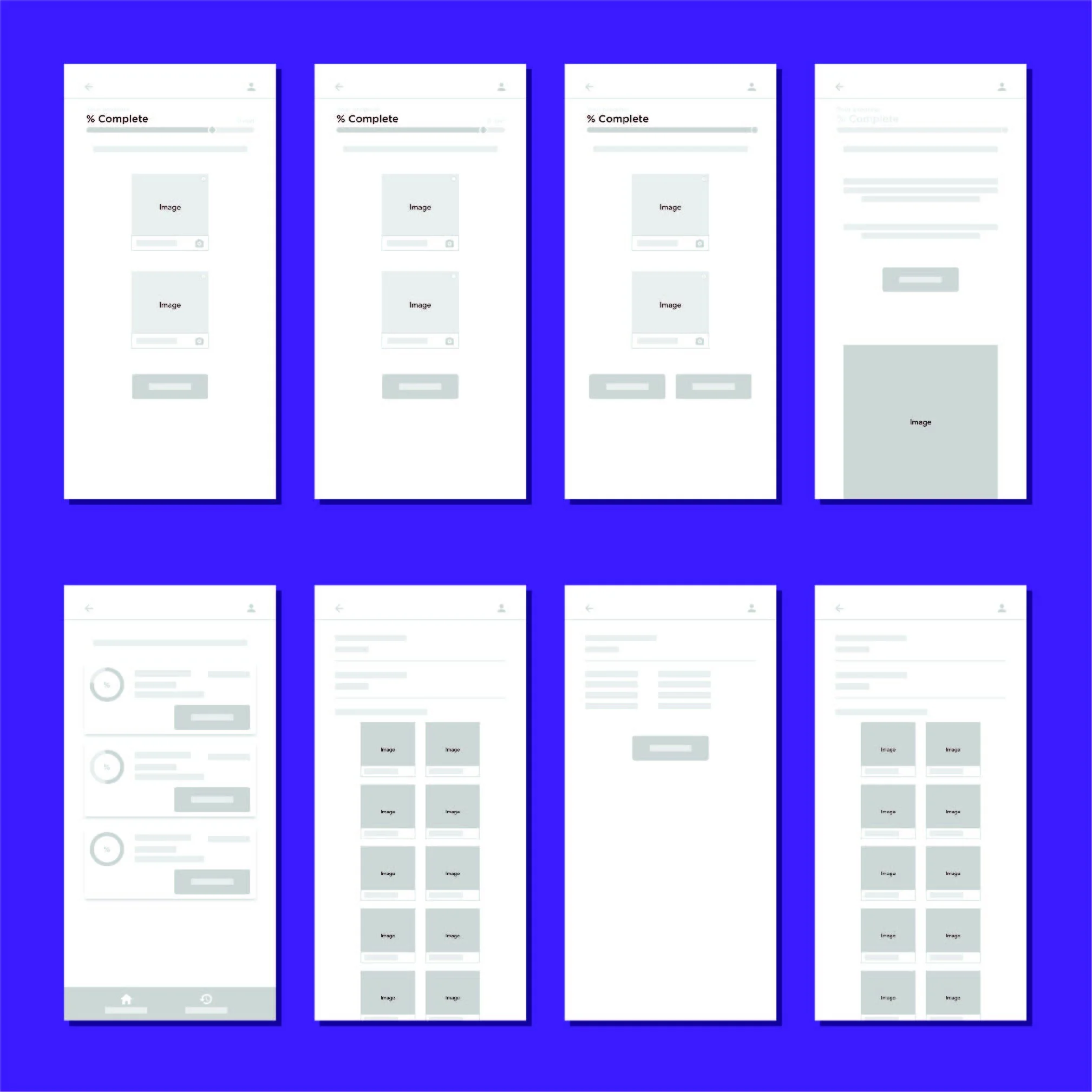
high fidelity mockup


key findings
“More user friendly and I actually feel engaged.”
The progress bar made a big difference in the users attitude about the process
The illustrated images of the mouth were not disturbing at all
There are still too many screening images to take which elongates the whole process
process & understanding
During the process of redesigning Berry.Care I went from many iterations by having a conversation with a few people and understanding their thoughts about the app. The two main things I would change for the future are to follow up with the client more often than I did during this process and only build what I need to test because I redesigned the entire app when it wasn’t fully used in the testing.